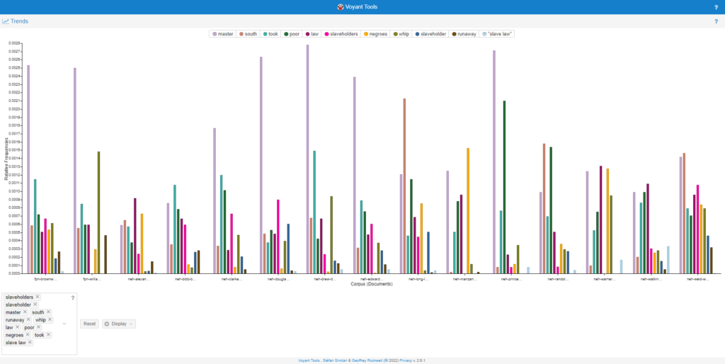
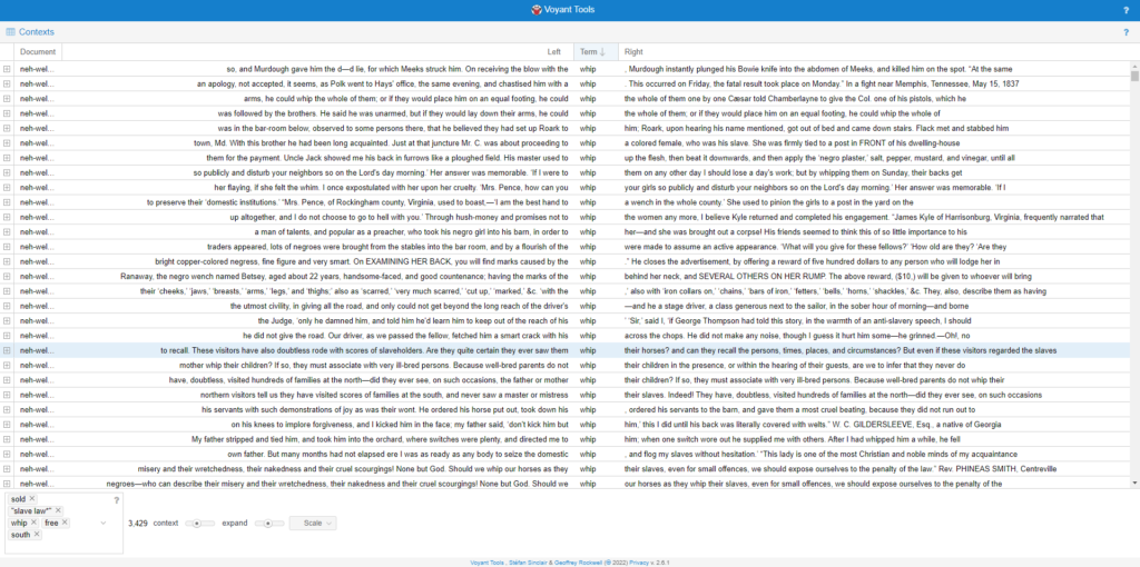
To start this activity I wanted to look through both sites first to see which one I would be more comfortable working with and I ultimately went with StoryMapsJS( https://storymap.knightlab.com/ ). Once I made my decision on the site I would use next was picking the formerly enslaved persons autobiography. I chose Frederick Douglass. The reason that I chose Frederick Douglass is because when I was doing topic searches through the autobiography a lot of good information showed up next to locations. With that being the case I read through some of the autobiography and when I found a meaningful event I skimmed around. This is to help me locate any possible location given in the text. If it’s clear where the place is I could easily mark it on the story map. If not then I did a little more digging on the internet to help find a more precise location. After I was about to find the event that I wanted to be in the story maps and found the location I made a quick headline and description to explain what that location meant to Frederick Douglass. Once all of that stuff was done I went to google to find photos for some of the slides. I also used the autobiography cover as the cover image to my story map. That’s pretty much the entire process of how I made my story map. I would say the most challenging part about making this was just the amount of reading before me. That and the changes in the naming schemes of some of the places. There were some places so old the name had changed while some still had the exact same name. The fun part was what you found out after reading and doing research. Here is my story map https://uploads.knightlab.com/storymapjs/facb6b62557ea745acffba762ad5949f/the-life-of-until/index.html

Geospatial visualization can help historians answer and ask more questions than before to get a deeper understanding for their research. It can help to paint a more vivid picture if you know when and where something took place. But also knowing more about the location of certain events can lead to better questions. There are 2 main concepts in geospatial visualization, one being absolute space. This concept is what I would call the more technical concept. That’s because this concept deals with distance. It deals with distance in more of a numerical sense to see how far something has come or gone. When thinking about absolute space you want to think about an absolute measure of distance. You want to think about the distance units of measurement such as inches, feet, miles, etc. This can help us to ask more questions such as “how far would a slave have to run to get to New York from South Carolina given a known route?” If given a map with a legend to help you understand the map it will lead us to deeper questions and open our ability to make historical inquiries. The other concept is representation space and I consider the other half of the puzzle. This concept paints the full picture like the lay of the land. It helps to understand where you are based on your surroundings. Representational space helps to associate experience and common gathering ground with physical locations. An example would be a church, where Christian people are known to come and worship the lord but to a regular person might just be a building. Representational space helps to add the content to absolute space (distance). This can really help to dissect and make new and improved questions. With both concepts working together to make a map you can track movement from place to place. There are downsides to both concepts that make them not 100% perfect. For absolute space it is not known what is happening with the land. You know the distance that you traveled but you would know what you’ve passed or possibly even where you came from. It also doesn’t really account for the lay of the land. You could think that going North 100 miles would lead you to a “Ohio” but that doesn’t account for hills and valleys that affect that mileage number. This is one of the ways maps lie to you so maps only account for flat straight distance that don’t give accurate trip information. While on the other hand representational space’s down sides are that it can give a good picture but will not help with knowing relative distance. This is also one way maps lie. Without a guide the distance between areas on a map may be really off making trips possibly longer or shorter. Overall a good map that has absolute and representational visualizations can be used to document travel or make good historical inquiries about travel.

When I first received my set of documents and topic words the first hypothesis that came to mind. These documents are based on the former slaves talking about laws set by law makers for slaveholders oppress black people free and non-free. Also about the harsh work and hardship that the slaves had to endure during captivity with all of this taking place in the south. To test this hypothesis I did a little bit of computation text analysis with the Voyant Tool to get a better understanding of what these topic words mean in the documents. First I put the most relevant topic words that would agree with my thesis into the Trends tool on Voyant and got the first graph below. After getting the graph from Voyant I took note of the similarities in the topic word in each document. I also took a look at the differences such as which documents did not have a word that all the others did have. When I noted the information from the graph I took, I then took the two documents with the most topic word frequency and the two with the least amount of topic word frequency. I will use these documents to narrow down the reading from 10 documents down to 4 so I can skim through to check my hypothesis. Before coming to a conclusion I tried using a few more tools in Voyant. The tool that really caught my interest was the context tool. This is shown in picture 2. This tool allows you to give Voyant a word(s) or phrase and it’ll give you the full sentence that comes before and after the word(s) or phrase you put in. This is useful for quick reading and helps to get context behind some of the topic words. After all of this I stand with my original hypothesis that, “These documents are based on the former slaves talking about laws set by law makers for slaveholders oppress black people free and non-free. Also about the harsh work and hardship that the slaves had to endure during captivity with all of this taking place in the south.” This became very obvious when i searched the phrase “slave law” in the context tool and notice that in every document it talked about how the law is against black people not matter what your status is. I think that my original hypothesis serves as a good base. A better hypothesis would be, “These documents are the accounts of people who has survived slavery and has the brain capacity to write about what happened to them and countless others. These accounts show clearly how the law worked against black people. Being free did not protect you from the white man and slavery is hard to escape. Also the hardships slaves and black people in general had to go through and not just black people from the south. The north was really quick to send black people they did not like back to slavery by selling them out of jails.” I think that this is better due to the depth that I was able to acquire using the Voyant tools.

https://voyant-tools.org/?corpus=925fb954830e7a78fb75b2c2713e399e&view=Trends&query=slaveholders&query=slaveholder&query=master&query=south&query=runaway&query=whip&query=law&query=poor&query=negroes&query=took&query=slave%20law&chartType=bar
https://voyant-tools.org/?corpus=925fb954830e7a78fb75b2c2713e399e&query=slave%20law&view=Contexts